11.30.2013

Painting In Progress

by Lisa Larrabee


I created studies of my son in preparation for this figurative landscape painting.  I also painted Spring Light to work out colors for the landscape.  My intention is to use the tree to portray the incredible intellectual, spiritual and physical growth of a young child.


I used Transparent Earth Red toned down with Phthalo Blue and thinned with OMS to tone the entire panel.  The lighter areas were wiped away with a clean rag.  The proportions for my son were sketched in over the wash.


I began blocking in color around the face so as not to loose the drawing.  I added Liquin Impasto medium to stretch out the paint without loosing body or brushwork.


The face is really on the light side at this stage.  It is light to allow for future translucent glazes of color.  Everything is incredibly rough, but the panel is mostly covered.  There is enough information for me to get a feel for the direction of this painting. 


I spent some time working on the face.  I want to add glazes to bring some of the background in, but I feel that is easier to just focus on the face at this stage.  Once I work into my background, it will give me a better frame of reference to determine just how much translucency I want to include.  The expression is critical.  There is a fine line with this one between thoughtful and sad.  My study seemed a bit melancholy, but it helped me to see where I needed to be more careful.


Don't you just hate when you notice something that is so critically important (like the placement of an eye) is not right?  This is actually the second time I repainted it, but it is finally in the right place! 


Finally, this portrait is starting to feel like my son (although he looks a bit startled).  Anyone who has ever done portraits knows how the slightest adjustment can change everything.


I repainted the lightest areas of the sun and sky, and began making some adjustments to the tree.  The entire landscape is basically at its original block-in stage.  Time to work it over top to bottom!


It is very important to me that this piece is vibrant and optimistic.  I had to push out of my comfort zone with cool yellows and spring greens.  Once I got away from the warm earth tones, it began to feel alive with the mood I had intended.  Now, I can better judge how I want to integrate the portrait.  It's a good turning point.


Once I worked into the background, the colors in the portrait were jumping out like I had cut and pasted the figure.  Once the paint was dry, I glazed a semi-transparent Hansa yellow light over the face.  I pushed it a little strong with the intention of bringing highlights back over the top when dry.  It did the trick of integrating the figure into the scene.  I also reworked value relationships, the jawline and the eyes (again).  I finally feel like I caught the elusive expression that I had been hoping for.  I see this look on my son's face all the time.  It appears serene, but you know there are thoughts just bouncing around inside.  He has a fantastic imagination!

I hope you will follow along.
~ Lisa

11.25.2013

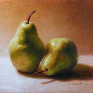
Pear Study

by Lisa Larrabee


This painting was done as a relatively quick study as a teaching demonstration.  The focus was on shape and shadow relationships.


You can see that this study began with a horizontal composition.  My painting surface is a sheet of paper canvas which is convenient for quick studies.  The surface was toned with a mix of Gamblin's Transparent Earth Red and and Phthalo Blue thinned with Gamsol (OMS).  The purpose of the blue was to neutralize the orange tones in the Earth Red.  I chose Phthalo simply because it is transparent as well.  

The goal during this block-in session was to place the pears on the canvas with accuracy.  I use straight lines which allow me to get more accurate angles for measurement.  Simplification is important.  (It can help to squint!)  My focus was on shape relationships (both positive and negative shapes).  The shadows were simplified to indicate the terminator.  This helps show the form by identifying the contour along the surface where the light changes to shadow.  Subtleties like reflected light were ignored. Before adding color, it was important to step back and evaluate the accuracy of the drawing and make changes as needed.


Color was blocked in wet into wet without additional mediums.  My goal was to mix and apply color with relative accuracy, but in a slightly restricted range of values.  The lightest highlights, in particular, are left until the next stage.


I had originally chosen the horizontal composition because I liked the strong diagonal shape created by the cast shadow.  However, I decided that the painting would be more interesting cropped.  The square composition accentuates the  yin yang "s" motion of the two pears and their stems.  When making a significant change, it is important to visually indicate it.   This allows you to continue your painting with the current composition in front of you so that the painting builds as a whole.


I applied the second layer of color after the first layer was dry/tacky.   For the background and shadow areas, I mixed in small amounts of Liquin Impasto.  I enjoy this medium because it allows you to develop rich layers of translucent color suspended in an impasto medium that can hold brushwork.  I did not use any medium for the lightest areas because of their opacity.  I found that the most interesting part of this study was the shifting colors/temperatures across the pear.  

Take pleasure in the ordinary!
~ Lisa

11.09.2013

Painting a Child Portrait

by Lisa Larrabee

It is a unique experience to paint the portrait of a child verses an adult.  The proportions are a bit different, and the edges all seem softer.  Even with this in mind, I had to take careful measurements and correct the placement of features and key shapes.  I started this painting demo with a thinned wash of Gamblin transparent earth red and torrit grey.  I have previously started this process without neutralizing the wash with grey.  I found that it was more difficult to block in with accurate color over such a warm base, so I added the grey.  Blue would have worked just as well to neutralize the orange tones. The image below shows how far I got in part one of my painting demo.


When you block in with a wash and immediately begin sketching in paint, it is easy to "erase" any incorrect lines by blending them away and redrawing.  This was very useful in this case, because I had corrections that I needed to make in the very early stages.  It is important to continuously compare measurements to previous measurements so that you are building off of good information.  I did not begin blocking in any color/value until the measurements were consistently in relationship with each other.  This made it easier to add color with more confidence.


When I returned to work on this painting, the first issue that I wanted to address was the color.  Stage one was a little dull.  I began by brightening the light areas and then adding pinker tones throughout. There were some minor adjustments like the edge of the face.  Of course, the eyes needed to be much bluer and sparkle.  Although the painting feels like there is a looseness due to the sketchy unfinished areas, it was actually a study in deliberate color mixing, measurement and mark making.  This was a different way of working for me and I enjoyed every minute!

- Lisa