11.28.2023

Changing Direction

 by Lisa Larrabee


Some of my best exploration comes from my teaching demos.  Not always the demos themselves, but the paintings afterwards.  If I am teaching a technique, I tend to keep the demo pretty straightforward. This serves the purpose of teaching the process, but then I have a painting that I can play around with afterwards that I have no strong attachment to.  

I demonstrated a technique on how to use a reductive process in layers.  I discussed this process in a previous post that you can view here: A Reductive Process in Layers.

I love using my technique demos as a springboard for experimentation.  It has been one of the ways I have learned to let go and have some fun with the process.  I was taught to experiment in art school, but also to develop a plan through studies.  Sometimes these are quick sketches and other times I use Photoshop to explore variations.  If you are considering a change to your painting, it can be helpful to test out how it would look.  If you want to completely change the direction of your piece, print out several pictures and try whatever you feel like before committing to the changes on your artwork.


In this example, I printed out a small photo of my painting on regular printer paper.  I used a white pastel pencil to draw over the top.  I find the process of drawing over a print can be more freeing and intuitive than manipulating the image in Photoshop.  Soft pastels work great for changing colors and you can blend them to let the image show through or use them more opaquely to cover areas.


In contrast, my Photoshop version is stiff, but it served its purpose.  I was not trying to create a finished image.  I only wanted to plot out my shapes in advance.  I am working to be more intuitive and responsive to my painting.  Still, having a rough plan gave me more confidence to make a dramatic change.


Above is a picture of my actual painting rather than a print or digital manipulation.  I used titanium white paint mixed with cold wax medium applied very thinly with a brayer roller. Once I transferred the leaves, I used a brush, Q-tip and OMS to remove the paint in a similar method described in the reductive process from the demo stages.  I experimented with rubbing away paint/cold wax outside of the circle using an old cloth once the paint had started to set up.  I was excited to discover that I could remove the paint/cold wax so cleanly, but I didn't like how it felt stiff as though I had cut it out of  vellum.  I might want that effect in the future, so it's important to note the process because it could come in useful elsewhere.


After it dried, I went back in with paint and cold wax medium.  I alternated between pallet knives, scrapers, rollers and a cloth to wipe away what I didn't want. Suddenly, the circle took on a more luminous quality like the moon.  That gave me another direction to follow.


I decided to play up the idea of the moon by glazing transparent blues to darken the background and create more contrast.  Sometimes it is great to have a clear plan to follow.  Other times it is important to allow yourself to experiment, play and determine your direction from one stage to the next.

Art Challenge

When you feel like you already know the outcome and have done it before, change direction and try a whole new path.

  • Choose a drawing or painting that you are willing to let go and transform.
  • Print out small photos of your artwork onto plain paper and use paint or pastels to make bold changes to your copies before committing to change the original.
  • Introducing a completely unrelated subject (like the ivy) can be a great way to shake yourself out of your routine process.
  • Respond to each change and see where it goes.  You choose the path forward as you go.
  • Have fun!  

10.24.2023

Upcycle Your Painting

by Lisa Larrabee

Do you every wonder what to do with old artwork that you feel is kind of meh?  Recycle it.  Better yet, upcycle it and make it better!  There are so many possibilities when it comes to upcycling your artwork.  Allow yourself to respond to what you have while simultaneously letting it go.  

10.08.2023

What's Relative?

by Lisa Larrabee

Value is relative.  Temperature is relative.  Color is relative.  There is that word relative again!  To simplify, all of these qualities are affected by their context.  They exist in relationship to their surroundings. When we change the colors or values around a subject, the relationship to the subject also changes.  Being aware of the effects colors and values have on each other can help you create color and value relationships with more accuracy.  Understanding the relationships can empower you to use your knowledge to enhance a color or create emphasis by using surrounding colors and values with intention.

Relative Value

In this example, the background is a gradient from light to dark.  Is the circle also a gradient from dark to light?  No, but it can appear that way.  The top of the circle appears slightly darker against the light background.  The bottom of the circle appears slightly lighter against the dark background.  

8.24.2023

Paint with Charcoal

by Lisa Larrabee

Charcoal is both bold and forgiving.  You can blend and smudge charcoal or sharpen it to draw with precision.  Charcoal is a staple in most drawing classes, but did you know that you can also paint with it?


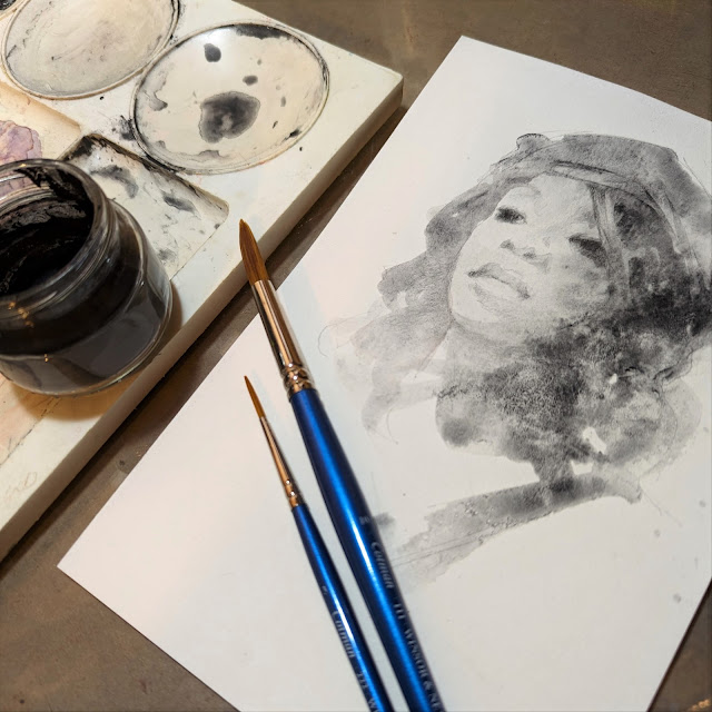
If you mix charcoal powder with water, you can paint using a process that is similar to watercolor.  The charcoal powder often pools and settles creating interesting patterns as it dries.  When the water evaporates, all that is left on the paper is the charcoal.  This charcoal can now be manipulated using traditional dry charcoal techniques.  You can blend, erase and add details using blending stumps, charcoal sticks and charcoal pencils.

8.03.2023

Quick & Bold Graphite Studies

   by Lisa Larrabee


Graphite is a staple for any artist.  It can be used for a variety of purposes from doodles to stunning finished works of art.  It is stable, easy to transport and very forgiving.  It is also inexpensive and convenient. There's a good chance you are near a graphite pencil as you read this, so you can join in with the Art Challenge!  
Graphite can be used in a variety of ways.  For the purpose of creating quick studies, I will stick with a medium hardness HB pencil. You can also use a classic #2 yellow pencil with the pink eraser.  Nothing fancy is needed.

4.19.2023

Take Risks with Color!

 by Lisa Larrabee

Value does all the work, but color gets all the credit.  That phrase gets thrown around a lot, but what does that even mean?  

We love color!  Colors can be subtle or dazzling.  Colors are powerful and can be used to get our attention or to communicate feelings.  However, value relationships are often the foundation of a drawing or painting.  Values can be essential to providing structure and to creating the illusion of light, form and depth.

Organize Colors by Value

If you want to experiment and take some risks with color, it can help to begin by first considering your values.  In the example below, I began with a black and white photo reference that had a nice range of light, medium and dark values.  I selected colors fairly randomly based on what I thought looked interesting while making sure I had different values.  I then sampled the colors on my gray toned paper in order of dark to light.  


I have been inspired recently by the drawings of Viktoria Maliar and her bold mark-making and color choices.  It reminded me of exercises I did when studying the mark-making of Vincent Van Gogh's portraits back in college.  I approached this study similar to others I have done when experimenting with my color choices.  I focused on placing values where they belonged regardless of whether it made sense for the local color of the subject and with zero regard for lighting color or temperature.

4.06.2023

Give It Time

by Lisa Larrabee

If you follow my progress, you will know that I love to experiment. My exploration influences the classes I offer. In the last six months, I have taught classes on expressive drawing, experimental color and portrait essentials. During that time I focused on a variety of mediums outside of my traditional oil paint. I did not consciously consider how my exploration would effect my painting; I just absorbed the information. The painting below had been set aside for several months.  I wasn't sure how to finish what I had started.  When I recently returned to this painting, I had new solutions to try.


I loved the vibrancy and heat of the red-orange against the gray, but I was afraid I would lose the energy if I followed my traditional process because the color palette was out of my comfort zone. Setting this painting aside was essential.