
What do you consider before starting a drawing? An obvious choice would be to start with your subject. Then, maybe you consider the composition and how you want to place your subject. What you want to include verses what you might choose to leave out. Which medium you intend to use, etc. How much thought do you put into choosing a background tone? If you aren't thinking about these options, you are missing an opportunity.

A tone is the relative lightness or darkness of a color.
- White: When you choose to work on white paper, you begin by adding values in one direction. Your lightest value is already established and you can only add darker values. Working on white can give your artwork a light and airy quality if you let much of the white remain. It can also allow you to build luminous colors or a full value range from white to black.
- Mid-tone: Working on a mid-tone allows you to develop your artwork in two directions (from the middle out). It can help you establish a sense of light and shadow very quickly by blocking in darker shadow values and adding brighter, lighter values. Working on a mid-tone can also act as a unifier by showing the tone through different areas of the artwork. Drawing on a mid-tone gray paper feels very different than creating the same drawing on a mid-tone tan paper.
- Black: When you begin on a black surface, you can only add values in one direction (like with white). However, the black absorbs the light rather than reflecting it. This can desaturate your colors and darken the values of your medium. Create test samples to see how opaque your medium is and how light a value you can create over the black. This will help you establish the full value range you are working in over the black surface.
Value Traps
Be on the lookout for value traps. Working on each background value can have its own trap (or typical mistake) because value is relative. It is important to establish some general value relationships to provide context before adding detail. Your brain will subconsciously adapt to the values you are working within (even when you know consciously that you haven't added your darkest shapes or your brightest highlights).
When starting on white, block in dark and mid-tone areas. If you focus on the details in the subject too soon, before adding a dark background, you may find all of the values in the subject are too light because you developed them against white. The reverse can be true when working on black.
When starting on a mid-tone, it is also important to establish the value range you want to have in your finished piece. For example, if you wait to add all the highlights at the end, you may have to go back and adjust subtle value relationships because your brain was interpreting the mid-tone as a lighter value against the darks because it didn't have the light values for context.
Consider your medium. If you are working in graphite, you won't have the full range of dark values that you would have if working in charcoal. Explore what your value range is from light to dark using your chosen media on your selected background. If you want your drawing to be high-key (limited to lighter values) or low-key (limited to darker values), establish how dark and how light you want to go and then build value relationships within your chosen boundaries.
I recommend developing your artwork from general to specific so that you are building shapes and values in relationship to everything else.

In this example, I have used graphite pencils on white paper. After blocking in my initial sketch, I immediately began establishing values over everything that was not my brightest light. This is very similar to toning the paper before you begin, but it allows you to preserve the white of the paper where you know it is the lightest. If you tone the entire paper with graphite or charcoal, you will often not be able to fully erase back to white.
Art Challenge
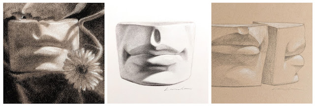
Demos of a mouth cast using different drawing media and paper choices
From left to right:
- Choose a simple subject to draw.
- Make sure that you have a good range of value shapes from light to dark.
- Draw or transfer your subject onto different values of paper.
- I recommend drawing the same subject multiple times to contrast the differences.
- Draw from general to specific.
- Establish your darkest and lightest values and keep the value relationships in mind as you develop your drawing.
- I recommend drawing the same subject multiple times to contrast the differences.

From left to right:
- Black and white charcoal pencils on Strathmore Toned Gray paper.
- Vine charcoal and charcoal pencils on drawing paper (white).
- Graphite HB pencil and white pastel pencil on Toned Tan paper.
Experiment with different toned papers or tone your own with graphite or vine charcoal.
Check out my previous post for more examples of working general to specific from a toned background: Drawing General to Specific: Graphite vs Charcoal
~ Lisa