12.07.2013

Alla Prima Portrait

by Lisa Larrabee


I have only recently began painting alla prima (wet into wet).  This was my second attempt at painting a model in a single session.  In the past, I usually used dry mediums for open studio or figure drawing sessions.  I feel like I learned a lot from the first painting that I was able to use with this one.  Two things made a huge difference: soft natural hair brushes (mostly red sable), and using more paint.  

More than half way through, I found myself working out drawing problems while stuck in the mid-tones.  After returning from the lunch break, I was determined to paint stronger highlights and add more color variations.  After making some big bold statements, my artist friend, Christy Olsen, said, "So... when are you going to punch up the highlights?"  Aargh!  She was right.  As soon as I stepped back, my "bold" highlights disappeared.  
Time to step it up.

One thing that I tried on this portrait that I had not done before, was to consciously switch the temperature of the highlights and shadows.  In reality, the model was lit with a warm light casting cool shadows.  When I chose to make the highlights cool, they helped the prominent side of her face pop with more interest.  Warming the shadows also helped bring some much needed life to side of the face that was turned away.  I was far enough back from the model that I could barely distinguish the edge of her face from the background.  Adding warmth helped define her face from the green by using the color for contrast without changing the value or adding definition that I could not see.

I was having so much fun, I could have kept painting for several more hours.  Perhaps it's best that I ran out of time before I could overwork it.  

-Lisa

11.30.2013

Painting In Progress

by Lisa Larrabee


I created studies of my son in preparation for this figurative landscape painting.  I also painted Spring Light to work out colors for the landscape.  My intention is to use the tree to portray the incredible intellectual, spiritual and physical growth of a young child.


I used Transparent Earth Red toned down with Phthalo Blue and thinned with OMS to tone the entire panel.  The lighter areas were wiped away with a clean rag.  The proportions for my son were sketched in over the wash.


I began blocking in color around the face so as not to loose the drawing.  I added Liquin Impasto medium to stretch out the paint without loosing body or brushwork.


The face is really on the light side at this stage.  It is light to allow for future translucent glazes of color.  Everything is incredibly rough, but the panel is mostly covered.  There is enough information for me to get a feel for the direction of this painting. 


I spent some time working on the face.  I want to add glazes to bring some of the background in, but I feel that is easier to just focus on the face at this stage.  Once I work into my background, it will give me a better frame of reference to determine just how much translucency I want to include.  The expression is critical.  There is a fine line with this one between thoughtful and sad.  My study seemed a bit melancholy, but it helped me to see where I needed to be more careful.


Don't you just hate when you notice something that is so critically important (like the placement of an eye) is not right?  This is actually the second time I repainted it, but it is finally in the right place! 


Finally, this portrait is starting to feel like my son (although he looks a bit startled).  Anyone who has ever done portraits knows how the slightest adjustment can change everything.


I repainted the lightest areas of the sun and sky, and began making some adjustments to the tree.  The entire landscape is basically at its original block-in stage.  Time to work it over top to bottom!


It is very important to me that this piece is vibrant and optimistic.  I had to push out of my comfort zone with cool yellows and spring greens.  Once I got away from the warm earth tones, it began to feel alive with the mood I had intended.  Now, I can better judge how I want to integrate the portrait.  It's a good turning point.


Once I worked into the background, the colors in the portrait were jumping out like I had cut and pasted the figure.  Once the paint was dry, I glazed a semi-transparent Hansa yellow light over the face.  I pushed it a little strong with the intention of bringing highlights back over the top when dry.  It did the trick of integrating the figure into the scene.  I also reworked value relationships, the jawline and the eyes (again).  I finally feel like I caught the elusive expression that I had been hoping for.  I see this look on my son's face all the time.  It appears serene, but you know there are thoughts just bouncing around inside.  He has a fantastic imagination!

I hope you will follow along.
~ Lisa

11.25.2013

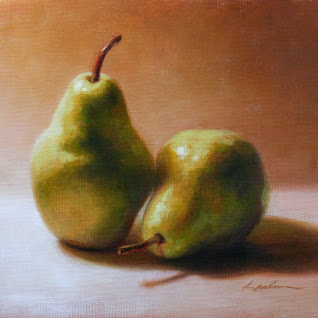
Pear Study

by Lisa Larrabee


This painting was done as a relatively quick study as a teaching demonstration.  The focus was on shape and shadow relationships.


You can see that this study began with a horizontal composition.  My painting surface is a sheet of paper canvas which is convenient for quick studies.  The surface was toned with a mix of Gamblin's Transparent Earth Red and and Phthalo Blue thinned with Gamsol (OMS).  The purpose of the blue was to neutralize the orange tones in the Earth Red.  I chose Phthalo simply because it is transparent as well.  

The goal during this block-in session was to place the pears on the canvas with accuracy.  I use straight lines which allow me to get more accurate angles for measurement.  Simplification is important.  (It can help to squint!)  My focus was on shape relationships (both positive and negative shapes).  The shadows were simplified to indicate the terminator.  This helps show the form by identifying the contour along the surface where the light changes to shadow.  Subtleties like reflected light were ignored. Before adding color, it was important to step back and evaluate the accuracy of the drawing and make changes as needed.


Color was blocked in wet into wet without additional mediums.  My goal was to mix and apply color with relative accuracy, but in a slightly restricted range of values.  The lightest highlights, in particular, are left until the next stage.


I had originally chosen the horizontal composition because I liked the strong diagonal shape created by the cast shadow.  However, I decided that the painting would be more interesting cropped.  The square composition accentuates the  yin yang "s" motion of the two pears and their stems.  When making a significant change, it is important to visually indicate it.   This allows you to continue your painting with the current composition in front of you so that the painting builds as a whole.


I applied the second layer of color after the first layer was dry/tacky.   For the background and shadow areas, I mixed in small amounts of Liquin Impasto.  I enjoy this medium because it allows you to develop rich layers of translucent color suspended in an impasto medium that can hold brushwork.  I did not use any medium for the lightest areas because of their opacity.  I found that the most interesting part of this study was the shifting colors/temperatures across the pear.  

Take pleasure in the ordinary!
~ Lisa

11.09.2013

Painting a Child Portrait

by Lisa Larrabee

It is a unique experience to paint the portrait of a child verses an adult.  The proportions are a bit different, and the edges all seem softer.  Even with this in mind, I had to take careful measurements and correct the placement of features and key shapes.  I started this painting demo with a thinned wash of Gamblin transparent earth red and torrit grey.  I have previously started this process without neutralizing the wash with grey.  I found that it was more difficult to block in with accurate color over such a warm base, so I added the grey.  Blue would have worked just as well to neutralize the orange tones. The image below shows how far I got in part one of my painting demo.


When you block in with a wash and immediately begin sketching in paint, it is easy to "erase" any incorrect lines by blending them away and redrawing.  This was very useful in this case, because I had corrections that I needed to make in the very early stages.  It is important to continuously compare measurements to previous measurements so that you are building off of good information.  I did not begin blocking in any color/value until the measurements were consistently in relationship with each other.  This made it easier to add color with more confidence.


When I returned to work on this painting, the first issue that I wanted to address was the color.  Stage one was a little dull.  I began by brightening the light areas and then adding pinker tones throughout. There were some minor adjustments like the edge of the face.  Of course, the eyes needed to be much bluer and sparkle.  Although the painting feels like there is a looseness due to the sketchy unfinished areas, it was actually a study in deliberate color mixing, measurement and mark making.  This was a different way of working for me and I enjoyed every minute!

- Lisa

9.28.2013

Painting the Light

by Lisa Larrabee

Westward Moon
2nd Place Acrylic & Oil, Richeson 75 
International Competition
24" x 18"
artist Lisa Larrabee

Sunrises and sunsets are so beautiful that it can be hard to take your eyes away from them and turn around. When you do, the reward can be equally as great.  Capturing the blazing red-orange light hitting the tops of the trees with the moon still overhead was my goal.  This began as a demo that I did over two painting sessions for my Acrylic & Oil painting class.  The final session was painted in my studio.


In the first class, I used Gamblin Gamsol (OMS) to thin Transparent Earth Red to cover the panel (oil primed linen).  With a little OMS on my brush, I lifted out the moon and wiped it white with a paper towel.  The trees were blocked in with a little Cobalt added to the mix.  What I love about this method is that I can adjust and move around elements on my panel with incredible flexibility.  It is my new favorite way to begin!


Again, I don't know why the color changed when uploading to my blog.  I tried to adjust and upload again, but it is just off.  I began painting the sky with cobalt, titanium white and yellow ocher to warm it up (that is the part you can't tell).  As it transitions down, there is more ocher and then cadmium red. This first layer of color is applied thinly to allow for some of the warmth of the under-painting to show through.  I switched to translucent sap green with some cobalt to glaze or scumble over the land and lightly over the trees.  I brought in some ocher and a bit of white to add opacity.  I needed to cool off the green from the bottom up.  By sandwiching the light part of the trees between the cooler sky and ground, it appears much more red-orange, but I actually painted very little on that part today.  I  toned it down with green, but it seems much redder than it did in the under-painting because of the relative colors.


During the third and final session I repainted the majority of the painting.  Overall, I feel that I captured the light that wanted to of the sun rising behind me and hitting the trees.  I am happy with the result.  I hope that you enjoy it as well.

~ Lisa

Spring Light: Painting Stages

by Lisa Larrabee

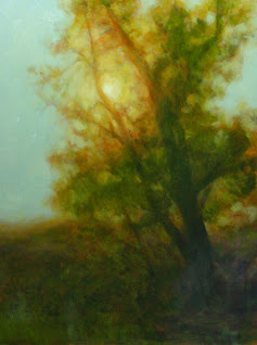
Spring Light
Oil on Panel
16" x 12"
artist Lisa Larrabee

This landscape painting is a study for a larger piece that I am working on.  The larger painting will include my son, Nathan.  It is intended to represent intellectual and spiritual growth and transformation.  I realized as I was working out the composition that the original tree reference I chose did not support this concept.  I created this study to experiment with color and mood to better tell the story.


I realize that this doesn't look much like a study for a green tree.  This is just the under-painting.  I began this piece in the same manner as my self-portrait.  I used Gamblin Transparent Earth Red and Cobalt Blue Hue thinned with Gamsol (OMS).  Because I started on a white panel (instead of my usual method of toning a panel and letting it dry), I was able to lift out the lighter areas right from the beginning.


This picture shows the process part way through blocking in the color on this study.  I typically keep to a warm color pallet, so the green is a bit out of my comfort zone.  That is half the fun!  I definitely need to bring greens down into the ground.  I consciously work to begin loose and build detail without losing too much of the initial energy that comes with blocking it in.  I guess the key is knowing when to stop.


I didn't feel like I was quite capturing the mood that I wanted, so I started by glazing over everything with a translucent yellow.  This helped me to shift gears without the new colors feeling "off" in the context of the existing colors.  It is easier to take risks on a study than on the larger painting because you can cover more ground quickly.

~ Lisa

9.20.2013

Self-Portrait: Finished

by Lisa Larrabee


I am beginning to wonder if you can paint a self-portrait indefinitely. I feel like I have achieved what I wanted to, so I am declaring this one finished. There are several other projects in the works that I am excited to devote some more time to. Overall, I enjoyed this entire process.

9.12.2013

Self-Portrait: One Thing Leads to Another

by Lisa Larrabee


Have you ever noticed that the closer you get to something the more there is to do? When I start to get some areas more accurate, other inaccuracies present themselves.  Tonight, I worked to get the pieces (drawing/proportion, values, color temperatures) into better relationships. Correcting some relationships made the incorrect relationships become more apparent.  For example, it bothered me that the eye on the left had looked dull.  It looked dull because the values were too close to the eye on the right that was in direct light with a highlight (but the left received no highlight).  To make the left eye feel more in shadow, I needed to make it darker.  With that realization, I noticed that all of my shadows were too light in value.  I also discovered some issues with the eye shape and the relationship of the left eye to the nose.  Changing the nose affected the mouth, etc.  The good news is that it keeps moving in the right direction. 

9.10.2013

Self-Portrait: Painting Eyes

by Lisa Larrabee


I think one of the biggest tricks when painting eyes is not to paint too much.  It is so important to simplify. The goal isn't to capture every eyelash, but to convey how the light travels across the form.  Ideally, if this is done with accuracy, the eyes communicate with you.  I think these eyes are fairly close to finished, but I feel that they look a little startled.  I also intend to drop the value of the eye on the left a bit.  It doesn't read that it is in shadow compared to the eye on the right (except that it doesn't have the highlight). We shall see how the rest of the painting develops.


I want to mention how much fun I am having with this painting.  Because it is a study just for me, I feel free to push myself.  I really wanted to focus on color temperature and I think I am making progress.  I don't know why I didn't do this sooner!

9.09.2013

Self-Portrait: Stage 3

by Lisa Larrabee


I realized when I sat down, that I needed to get the rest of the orange covered. It was still affecting my skin tones way too much. I also needed to push the darks so that I had a better range of values. There is more to do, but I am happy with the progress I made.

Self-Portrait: Adding Color

by Lisa Larrabee


At this early stage, I wanted to get areas covered with an approximation of color.  I needed to tone down the warm under-painting because it was affecting the cooler skin tones that I was putting down.  At this stage, I feel that I lost some of the likeness because I was working to get better color notes.  Still a long way to go.

9.08.2013

Self-Portrait: Blocking It In

by Lisa Larrabee


Who will sit patiently at odd hours as I work to improve my skills? ME! This is a picture of the first stage of a self portrait. I began without a preliminary drawing. It took a little time to get a feel for how to push and pull the paint. I lifted out highlights to reveal the lead white primed linen panel. I liked starting this way. It allows for both freedom and control.

9.02.2013

Two Pods: Painting from Life

by Lisa Larrabee

I was given some advice from an amazing still life painter, Scott Fraser.  He told me that I needed to paint from life.  It was the most obvious, yet necessary advice.  After seeing his paintings in person, I already knew that was exactly what I needed to do.  The richness in his work comes from observing what is in front of him without the limitations of the camera.  This is something I have known, yet I have found too many reasons not to follow this advice (limited time, limited space, expediency...).  I came home and saw my work with fresh eyes.  Eyes that saw the limitations of working from photography alone.  So, here is my goal.  I will be giving myself assignments.  I know where I want my work to go and I have a good idea of what it takes to get there -time and hard work.  Drawing and painting what I see without shortcuts.  The bottom line is that there is no such thing as a short cut when it comes to developing as an artist.


In the early stages, I experimented with a different way for me to block in the shapes.  I started on white, brushed on a thinned layer of transparent earth red and began wiping out highlights and pushing darks.  It was important to me that the shapes were accurate.  I used a view-finder to help keep the shape relationships correct.


After the under-painting was dry, I began  adding color.  I tried to keep translucent colors in my darks and build opacity in the lights.  At this stage, I hated the painting and wondered why I decided to do a still life!


I had two choices: finish the painting, or give up because I would need to move the still life and viewfinder before I could paint something new.  Since I was unwilling to give up so easily, I forced myself to sit back down the next night, and I had a wonderful time.  I experimented with different ways to apply paint with different brushes.  I tried to keep edges varied and be very conscious of light and shadow temperature.  Because I had no specific expectations, I was able to play and, most importantly, learn!

~ Lisa


6.28.2013

Fleeting: Final Painting Stage

by Lisa Larrabee


I want to make a point about lighting for other artists and students.  Unless you have a studio with amazing north light (and don't need to paint in the evening) you will have to rely on artificial light to paint.  I have used a mix of OttLite Natural daylight bulbs and GE Reveal daylight bulbs in my studio.  OttLites were recommended, but I found them very hash to paint under.  When I posted my last image, the color was adjusted to closely approximate what my painting looked like in my studio.  However, in the daylight, much of the warmth was reduced (even though I was using "daylight" bulbs).  I replaced the two remaining Reveal bulbs with OttLite bulbs to finish my piece.  It was difficult to adjust to the harshness at first, but the following morning my painting looked the same in the daylight as it had in my studio.  It may be difficult to notice a difference in the photographs, but it is noticeable in person.  I also bumped up a few of the brightest highlights.  I can now officially say that it is finished.  I hope that you enjoy it.

~ Lisa

6.22.2013

Fleeting: A Painting in Progress -stage 4

by Lisa Larrabee


The process of finishing this painting has become a balancing act between the tree and the figure.  I played with more contrast and harder edges on the figure, but decided that I was happiest where the two were more harmonious.  I most enjoy the repeating patterns of the arms and branches.  I had felt that it was finished, but on further reflection in the daylight, there are some additional changes I want to make.

~ Lisa

6.18.2013

Fleeting: A Painting in Progress -stage 3

by Lisa Larrabee


As I worked on the figure, drawing issues became more apparent.  I spent much of my time measuring, checking and rechecking the proportions.  I think it is pretty close so it's time to move on for now.

~ Lisa

6.16.2013

Father's Day

by Lisa Larrabee


3 a.m.  
Graphite and white pastel on toned paper
artist Lisa Larrabee

Happy Father's Day to my husband, Greg, the father of our amazing twin boys.  All my love!

~ Lisa

6.14.2013

Fleeting: A Painting in Progress -stage 2

by Lisa Larrabee


I had a lot of fun bringing some color into the landscape.  At this stage I discovered that the Eucalyptus study that I started with proved to be invaluable.  It is still at an early stage, but I was capturing the essence of what I wanted very quickly.

~ Lisa

6.12.2013

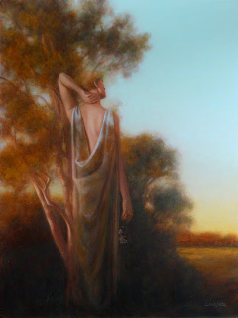
Fleeting: A Painting in Progress

by Lisa Larrabee

I have typically shared my painting stages as an overview upon completing a piece.  Instead, I am going to share my process while I am in the midst of creating my current painting, Fleeting.

The inspiration for this piece is the Eucalyptus across the street from my house.  I loved the color of the light hitting the leaves and the pale bark of the branches.  I stepped out my front door and took some photos for future reference.


I began by creating a small (14" x 11") color study of the Eucalyptus to work out colors and techniques that I wanted to use on the figurative landscape.  I hope to keep the warmth and softness of the study on a larger scale.


I knew that I wanted to use loose draping fabric and bring up an arm (or arms) to create repetition with the branches.  Once I had shot some photographs, this pose jumped out at me and altered the overall direction I had intended for the piece.  The narrative began unfolding and I had to shift focus to the right.  After composing and editing in Photoshop, I was ready to proceed.  I used a sepia hard pastel pencil to draw directly onto my toned panel. 


 Lines only give a hint at how accurate your drawing is.  I painted in values using a mix of burnt sienna and cobalt blue thinned with a 50/50 mix of Gamblin Galkyd and Gamsol (OMS).  With the shapes of the shadows blocked in it is easier to see where to make corrections.  I also intend to paint some of the landscape through the figure, so I wanted to set my drawing before taking a looser approach to the landscape.

~ Lisa

La Primavera: Painting Stages

by Lisa Larrabee


La Primavera
Oil   24" x 18"
artist Lisa Larrabee

This painting is of a mother, pregnant with her second child, interacting with her young daughter.  I took photo references very informally in her home, where her daughter was more relaxed.  Blooming magnolia trees were added in Photoshop to create the more symbolic setting of springtime and renewal.


I began this piece by toning a 24” x 18” museum series gesso-board panel with a thin wash of burnt sienna.  Once dry, I used a blue toned transfer paper to accurately put my drawing onto the board.  So as not to lose the accuracy of the transfer, I carefully began blocking in the face and branches in oil using only brown and white.  I continued with key elements like the hands and face of the girl.  In areas where the values were too similar to the background, I painted some darker values into the background to help keep the value relationships aligned.


I decided to paint the background in sections so that I could work the colors wet into wet in order to keep the edges soft.  I started with carefully placed blue shapes so that I would not need to try and paint the lighter flowers over the top.  This section was somewhat experimental for me.  I painted back over branches and used a large soft brush to periodically soften shapes and blur edges.  I planned to bring the rest of the background to this level of completion in order to make more informed decisions about how to paint in the foreground. 


You may have noticed that my style for blocking in this stage changed from how I began.  This is because I took a break from this painting to complete a landscape, but part way through I wasn’t excited about it.  I took a chance and completely repainted the landscape.  I also started experimenting with galkyd gel.  This allowed for some translucency while still holding brushstrokes.  I loved painting with it!  It made me excited to get back to this painting.  Whenever possible, I choose to loosely block in the whole painting instead of one piece at a time.  It allows me to get a better sense of how the entire painting will develop. 


While painting the background, I realized that I needed to soften it because it felt too busy.  I scumbled over most of it with titanium white cut with Liquin impasto.  I used white to brighten the background, but also to diffuse the edges because it is opaque and covers what is beneath it.  Even though the background was not finished, it was developed enough to move on to other areas in order to bring the painting into balance. 


I painted the foreground branches and let them dry so that I could block in the shadow color for the flowers very loosely.  The color was tricky because it looked green.  I kept rechecking the color and trusting that the reason it looked green was because so much of the red-orange from the under-painting was visible.  Once I adjusted the color of the dresses, the flowers began to feel more accurate.  Saying that color is relative is an understatement.


 I pushed my value range as went over different areas, primarily by adding more light values, but also by repainting over some key branches.  There was a lot of walking away from the easel to see how each change affected the entire piece.  I feel that it all pulled together and captured what I had envisioned for this painting.

~ Lisa