
by Lisa Larrabee

I created studies of my son in preparation for this figurative landscape painting. I also painted Spring Light to work out colors for the landscape. My intention is to use the tree to portray the incredible intellectual, spiritual and physical growth of a young child.

I used Transparent Earth Red toned down with Phthalo Blue and thinned with OMS to tone the entire panel. The lighter areas were wiped away with a clean rag. The proportions for my son were sketched in over the wash.

I began blocking in color around the face so as not to loose the drawing. I added Liquin Impasto medium to stretch out the paint without loosing body or brushwork.

The face is really on the light side at this stage. It is light to allow for future translucent glazes of color. Everything is incredibly rough, but the panel is mostly covered. There is enough information for me to get a feel for the direction of this painting.


I spent some time working on the face. I want to add glazes to bring some of the background in, but I feel that is easier to just focus on the face at this stage. Once I work into my background, it will give me a better frame of reference to determine just how much translucency I want to include. The expression is critical. There is a fine line with this one between thoughtful and sad. My study seemed a bit melancholy, but it helped me to see where I needed to be more careful.

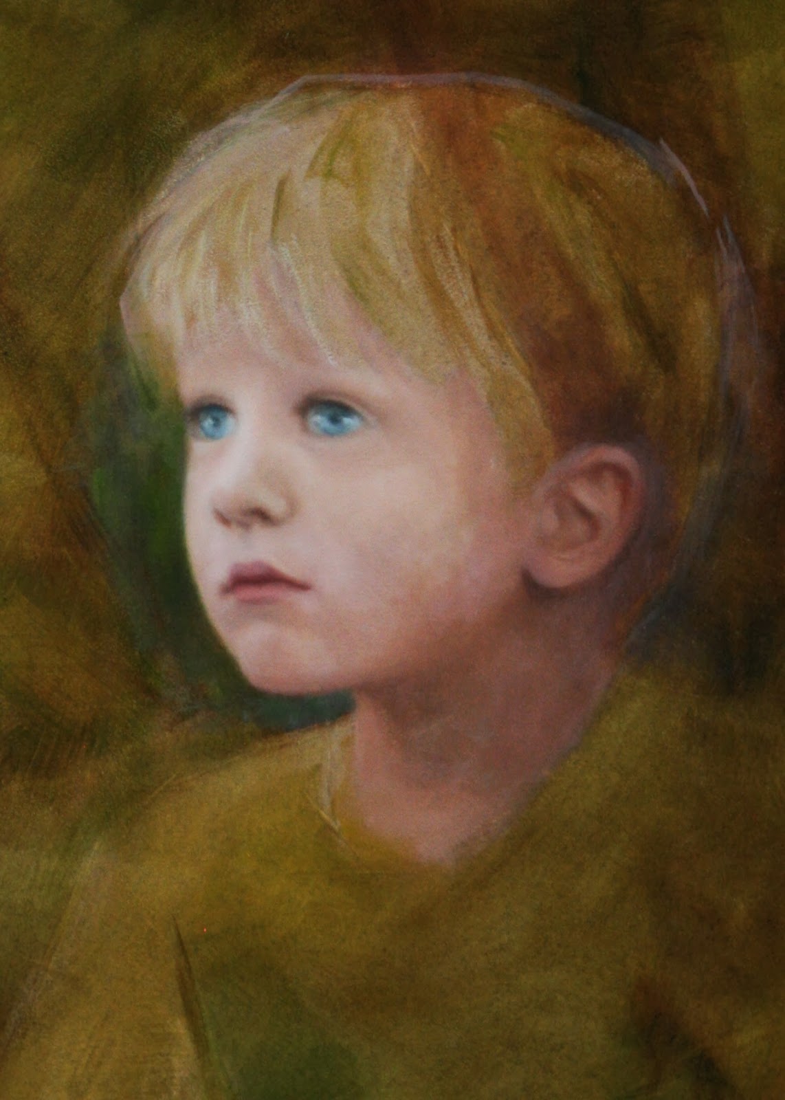
Don't you just hate when you notice something that is so critically important (like the placement of an eye) is not right? This is actually the second time I repainted it, but it is finally in the right place!

Finally, this portrait is starting to feel like my son (although he looks a bit startled). Anyone who has ever done portraits knows how the slightest adjustment can change everything.

I repainted the lightest areas of the sun and sky, and began making some adjustments to the tree. The entire landscape is basically at its original block-in stage. Time to work it over top to bottom!

It is very important to me that this piece is vibrant and optimistic. I had to push out of my comfort zone with cool yellows and spring greens. Once I got away from the warm earth tones, it began to feel alive with the mood I had intended. Now, I can better judge how I want to integrate the portrait. It's a good turning point.

Once I worked into the background, the colors in the portrait were jumping out like I had cut and pasted the figure. Once the paint was dry, I glazed a semi-transparent Hansa yellow light over the face. I pushed it a little strong with the intention of bringing highlights back over the top when dry. It did the trick of integrating the figure into the scene. I also reworked value relationships, the jawline and the eyes (again). I finally feel like I caught the elusive expression that I had been hoping for. I see this look on my son's face all the time. It appears serene, but you know there are thoughts just bouncing around inside. He has a fantastic imagination!
I hope you will follow along.
~ Lisa