12.29.2022

A Reductive Process In Layers

by Lisa Larrabee

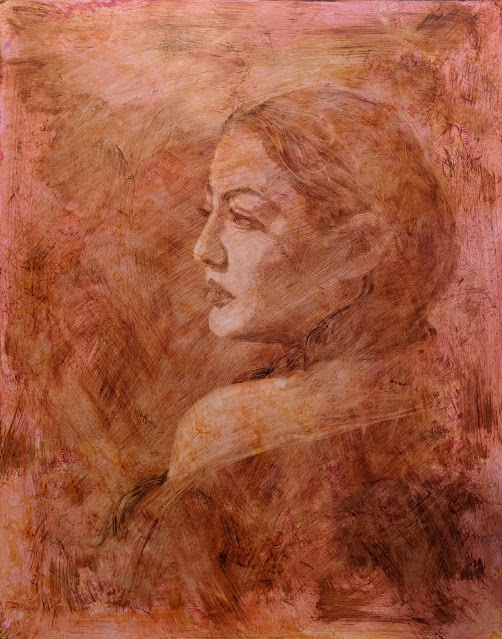
One technique that I love to use while drawing or painting is a reductive process.  You begin by using your chosen medium to tone the surface.  You can use graphite, charcoal, soft pastel or oil paint.  This establishes a unifying value to work from.  The reductive aspect is that you remove the medium to reveal the lighter values underneath.  You can erase any of the dry mediums and wipe away the oil paint.  In this demo, I used both Q-tips and clean brushes to remove the pigment.  A little OMS (odorless mineral spirits) can remove the paint back to the surface.


I began toning with transparent earth red oil paint over a panel that already had a light pink layer that was dry.  This is why the lifted values only lift out to a light pink and not the original white panel.  Any added details were painted with the transparent earth red.  One thing that is freeing about this process is that you can wipe away any mistakes and try again.


Once the panel was completely dry, I added darker transparent color while experimenting with textures.  Mixing the paint with an alkyd thinned with OMS allowed me to make very fluid expressive brushstrokes.  I also used crumpled paper towels to lift textures.  Some OMS spatter added a bit more interest.


At this stage I repeat the lift out process.  Since the portrait is dry, I can remove paint from the face without disturbing it.  I reveal what I choose and leave the textures that I like.


I wanted to push the contrast so I repeated the process yet again.  This time adding cooler colors into the mix.  It is important to make sure that the pigments chosen are transparent or you will create a hazy opaque layer.  This can be a great effect, but it was not what I wanted.


Again, I removed pigment from the face and shoulder while the new layer was still wet.  The values on the face appear lighter, but they are not.  It is their relationship to the other values that changed.  As I added darker layers it created the illusion of lightening the values due to the increase in contrast.

This is a fun and flexible process to try.  It also gave me another demo to experiment on (which is where I play!).  In a future post, I will share how this demo transformed into Moonlight & Ivy.

~ Lisa

12.14.2022

Facial Features: Mouth Study

 by Lisa Larrabee


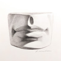
When developing portrait drawing skills, it is important to learn to see the facial features as objectively as possible.  It can be difficult to set aside the symbols we have learned, and the associations we make with certain features, in order to observe them accurately.  Drawing from a plaster cast can help you to see the form more objectively, but the symbols can still creep in.  


A piece of advice that I often give students who are struggling to separate the symbols (or prior drawing habits) from what they see, is to pretend the cast is an abstract sculpture.  Imagine that you decided to observe and draw this form while having no idea what it was.  If it were a purely abstract form, you would have no choice but to rely on shapes and value relationships to depict it.  If you can put yourself into that mindset, you may be quite surprised by how much the drawing ends up looking like a mouth. 

~ Lisa


View my post on drawing the structure of a mouth using cross-contour lines.


12.13.2022

Experimental Color

by Lisa Larrabee


Pink & Green
color study (detail)
Pastel on toned paper
artist Lisa Larrabee


I recently taught a class for the Art Verve Academy about adding a touch of color to your drawings.  The idea was to make simple controlled changes to see how dramatic the affect was on the image as a whole. It was a lot of fun and and a huge learning experience.

As we delved into more experimental color combinations, I felt compelled to join in the fun and play with colors that I would not usually use together.  I highly encourage anyone to give it a try.  Choose 2-3 colors (plus the background) and build a drawing without any expectations for how it will turn out.  You may surprise yourself!

I began by sketching the value shapes with a bright pink pastel pencil.  It is impossible for me to fully capture the experience with this photo, but the use of approximate complimentary colors in a similar value played with my eyes like crazy.  The pink felt like it was quite literally luminous and vibrated against the gray-green. The process felt a bit surreal as a result.


Although the purpose was to choose whimsical colors, it was important to focus on building values (regardless of the color).  I added a bold red-violet that was a darker value than the pink.  I placed the red-violet anywhere that I wanted to accentuate the form with more contrast.


My final step was to add white highlights.  I initially began with stronger highlights because it was more accurate to my reference.  However, the more white I added the less energy I captured of the  red/violet tones against the green.  I lifted out the bolder highlights and placed the light sparingly.  


I had a tremendous amount of fun exploring how the colors interacted.  There were elements I expected, but there were also results that I was surprised by.  It is amazing how relative color is and how dramatically one color can influence another.  If you give it a try, be prepared for a few unexpected results of your own.

~ Lisa

12.09.2022

The Freedom of Using an Opaque Medium

by Lisa Larrabee

Why are we so afraid of change? Wow, that’s a big question. Let’s reign it in a bit. Why are we so scared to make changes in our paintings?

Often, the biggest fear is that we won’t like the result. Maybe we are feeling pretty good about a painting and are afraid it won’t be as successful with the change. Sometimes the fear is that we won’t be able to disguise the change and that it will be visible in the final result. Whatever the reason, the fear is more of a mental obstacle than a physical one if you use an opaque medium.

Using opaque pigments means that you cannot see through them. This allows us to cover existing areas and make changes directly over the previous layers. Even if you are creating luminous, transparent glazes, you can make opaque changes to your painting and then glaze transparent layers over the top to unify the correction. The most important step is being willing to make the change in the first place.

One way to tackle any uneasiness you have over making changes to your painting is to practice making changes. It sounds too simple, but it is essential to gain the confidence to make the change when it counts. Often, we are willing to take bold steps with our work when we are completely unhappy with the piece. It places us in a what-have-I-got-to-lose mindset. This can be an absolutely frustrating place, but it is also a golden opportunity! Once in this mindset, there is no more fear! The trick is to allow yourself these opportunities without going through the pain of a failing painting. How? Create a designated time for studies and experiments. Give yourself a safe place to fail, rebuild, test, and explore without negative consequences.

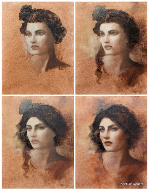
Let me use my portrait demo as an example. This demonstration was done over three sessions. With each session, there was a variation I chose to incorporate. It was fun changing her hairstyle and altering her gaze. I enjoy looking back at the stages and seeing how each change affects the overall image. (It’s important to note that objects like the flower and strand of hair could have been covered completely, but I enjoyed the looseness and seeing a bit of the history in this paint sketch).

Art Challenge
  • Choose a simple subject that changes over time.
  • Paint a small, simple study of it from life.
  • Make changes to your painting as your subject changes.

Some things change faster than others. Paint a flower as it blooms and/or wilts, ice cream that melts, or the mountains at different times of the day.

You can choose to document your painting stages to keep a history of the evolution, but don’t allow it to become too precious to paint over. Remember, this exercise is designed to give you the confidence to change your paintings.

~ Lisa