2.25.2025

Experimental Charcoal Painting


by Lisa Larrabee

There is a strong overlap between drawing in charcoal and painting.  Both processes allow you to add and subtract, blend, manipulate and build from simple shapes to subtle details.  However, it never occurred to me to actually paint in charcoal until I purchased charcoal powder.

In my post, Paint with Charcoal, I detail a process that I use when I begin with intention.  The images below were my very first experiments.

Painting with charcoal creates a versatile cross-over between drawing and painting.  I could move the charcoal powder in subtle washes and bold brushstrokes, then blend, erase and build the drawing using traditional charcoal methods.

4.02.2024

Explore, Learn & Play!

by Lisa Larrabee

One of my favorite things to do is use my teaching demos for artistic experimentation. In this example, I started with a painting demo that I created in one of my Power of Color classes that used a limited color pallet. I brought the demo into my Creative Pathways class and used it to further demonstrate additional painting techniques.


In my original demonstration, I added colors based on the values of my limited palette, not the color of the subject. The demo was quick and served its purpose, but it became more fun when I made a big mess over it!

11.28.2023

Changing Direction

 by Lisa Larrabee


Some of my best exploration comes from my teaching demos.  Not always the demos themselves, but the paintings afterwards.  If I am teaching a technique, I tend to keep the demo pretty straightforward. This serves the purpose of teaching the process, but then I have a painting that I can play around with afterwards that I have no strong attachment to.  

I demonstrated a technique on how to use a reductive process in layers.  I discussed this process in a previous post that you can view here: A Reductive Process in Layers.

I love using my technique demos as a springboard for experimentation.  It has been one of the ways I have learned to let go and have some fun with the process.

10.24.2023

Upcycle Your Painting

by Lisa Larrabee

Do you every wonder what to do with old artwork that you feel is kind of meh?  Recycle it.  Better yet, upcycle it and make it better!  There are so many possibilities when it comes to upcycling your artwork.  Allow yourself to respond to what you have while simultaneously letting it go.  

I had some silicone paint shapers that I really wanted to play around with.  Rather than starting on a blank surface, I looked for an existing painting that already had some nice colors and textures that I could build on. 

10.08.2023

What's Relative?

by Lisa Larrabee

Value is relative.  Temperature is relative.  Color is relative.  There is that word relative again!  To simplify, all of these qualities are affected by their context.  They exist in relationship to their surroundings. When we change the colors or values around a subject, the relationship to the subject also changes.  Being aware of the effects colors and values have on each other can help you create color and value relationships with more accuracy.  Understanding the relationships can empower you to use your knowledge to enhance a color or create emphasis by using surrounding colors and values with intention.

Relative Value

In this example, the background is a gradient from light to dark.  Is the circle also a gradient from dark to light?  No, but it can appear that way.  The top of the circle appears slightly darker against the light background.  The bottom of the circle appears slightly lighter against the dark background.  

8.24.2023

Paint with Charcoal

by Lisa Larrabee

Charcoal is both bold and forgiving.  You can blend and smudge charcoal or sharpen it to draw with precision.  Charcoal is a staple in most drawing classes, but did you know that you can also paint with it?


If you mix charcoal powder with water, you can paint using a process that is similar to watercolor.  The charcoal powder often pools and settles creating interesting patterns as it dries.  When the water evaporates, all that is left on the paper is the charcoal.  This charcoal can now be manipulated using traditional dry charcoal techniques.  You can blend, erase and add details using blending stumps, charcoal sticks and charcoal pencils.

8.03.2023

Quick & Bold Graphite Studies

   by Lisa Larrabee


Graphite is a staple for any artist.  It can be used for a variety of purposes from doodles to stunning finished works of art.  It is stable, easy to transport and very forgiving.  It is also inexpensive and convenient. There's a good chance you are near a graphite pencil as you read this, so you can join in with the Art Challenge!  
Graphite can be used in a variety of ways.  For the purpose of creating quick studies, I will stick with a medium hardness HB pencil. You can also use a classic #2 yellow pencil with the pink eraser.  Nothing fancy is needed.

4.19.2023

Take Risks with Color!

 by Lisa Larrabee

Value does all the work, but color gets all the credit.  That phrase gets thrown around a lot, but what does that even mean?  

We love color!  Colors can be subtle or dazzling.  Colors are powerful and can be used to get our attention or to communicate feelings.  However, value relationships are often the foundation of a drawing or painting.  Values can be essential to providing structure and to creating the illusion of light, form and depth.

Organize Colors by Value

If you want to experiment and take some risks with color, it can help to begin by first considering your values.  In the example below, I began with a black and white photo reference that had a nice range of light, medium and dark values.  I selected colors fairly randomly based on what I thought looked interesting while making sure I had different values.  I then sampled the colors on my gray toned paper in order of dark to light.  


I have been inspired recently by the drawings of Viktoria Maliar and her bold mark-making and color choices.  It reminded me of exercises I did when studying the mark-making of Vincent Van Gogh's portraits back in college.  I approached this study similar to others I have done when experimenting with my color choices.  I focused on placing values where they belonged regardless of whether it made sense for the local color of the subject and with zero regard for lighting color or temperature.

4.06.2023

Give It Time

by Lisa Larrabee

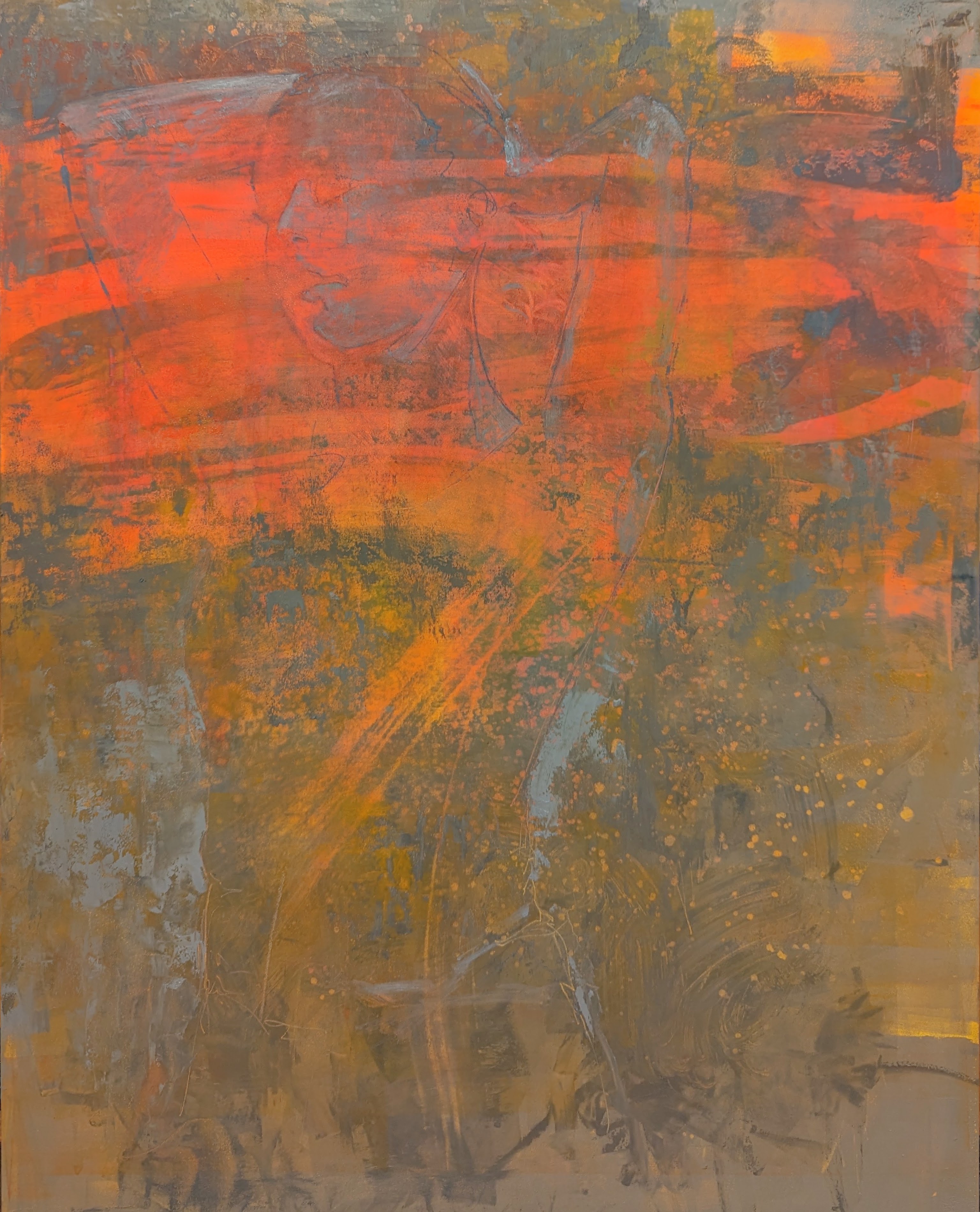
If you follow my progress, you will know that I love to experiment. My exploration influences the classes I offer. In the last six months, I have taught classes on expressive drawing, experimental color and portrait essentials. During that time I focused on a variety of mediums outside of my traditional oil paint. I did not consciously consider how my exploration would effect my painting; I just absorbed the information. The painting below had been set aside for several months.  I wasn't sure how to finish what I had started.  When I recently returned to this painting, I had new solutions to try.


I loved the vibrancy and heat of the red-orange against the gray, but I was afraid I would lose the energy if I followed my traditional process because the color palette was out of my comfort zone. Setting this painting aside was essential.

3.16.2023

Start with Color

by Lisa Larrabee

Why start your drawing or painting on a color?  A background color can set the mood for your artwork and unify the elements right from the start.  It has the power to neutralize or enhance the colors layered over it.  Certain background colors can add or reduce energy, effecting the entire piece.  When a single decision has so much influence, it is important to take the time to explore the possibilities!

Effects of a Background Color

There is much to consider when choosing a color to build upon.  Think about how much you want to allow the background color to show through. You can draw or paint in a way that lets large areas of the background color be visible, or you can let little bits of color show through between the marks or brushstrokes.  You can choose to layer or blend the medium so that the color shows through subtly.  Depending on the medium, you can also cover areas opaquely to hide the color underneath.  How much you choose to reveal the background color will effect the overall style and mood of your piece.

Profile on Cool (Whisper) & Profile on Warm (Promise) - by Lisa Larrabee

In these two examples there is a lot in common, but each painting captures a different mood.  Both portraits have soft edges, reduced detail, high-key values and are of the same model.  The portrait on the left was painted over a cool lavender background.  The portrait on the right was painted on a warm orange-pink.  It can be very helpful analyze the effect of a change when other elements stay the same. You can think of it like a scientific experiment where you keep most variables the same in order to best identify the effect of the change.

2.28.2023

Setting the Tone

by Lisa Larrabee

What do you consider before starting a drawing?  An obvious choice would be to start with your subject.  Then, maybe you consider the composition and how you want to place your subject.  What you want to include verses what you might choose to leave out.  Which medium you intend to use, etc.  How much thought do you put into choosing a background tone?  If you aren't thinking about these options, you are missing an opportunity.  


Choosing a Tone

tone is the relative lightness or darkness of a color.  

1.27.2023

Negative Space (Why It's Such a Big Deal)

by Lisa Larrabee

If you do an online image search for "negative space drawings" you will find a tremendous number of examples that range from traditional academic exercises to very creative design solutions.  Variations of negative space exercises exist at all levels of drawing classes (whether or not it is explicitly labeled as such).  So, what is "negative space" and why is it such a big deal?

1.24.2023

Facial Features: Cross-Contour Mouth Sketch

by Lisa Larrabee

If you want to improve your drawing and painting, take time to focus on your subject from an academic perspective.  Although it is essential to play and experiment, it is also important to dedicate time for disciplined study to learn more about your subject.  In this example, I focused on the mouth.  However, this type of practice will help you better understand the form of any subject.


I worked from a photograph for this study.  I added cross-contour lines to better understand the dimensional form of the mouth.  Cross-contour lines are lines that follow the surface of the form.  (In contrast, contour lines follow the edge or boundary of the form like an outline).

1.17.2023

Expressive Mark Making

by Lisa Larrabee

Not everything we make needs to become something.  I cannot stress enough the importance of experimentation and play without an end result in mind.

This is a demo where I modeled a variety of different types of mark-making using graphite and charcoal.

There is absolutely no wrong way to do this.  Give yourself a nice large sheet of paper and explore how much variety you can create using drawing tools that you already have.  Turn pieces on their side.  Twist the pencil or piece of charcoal or graphite between your fingers. Vary the amount of pressure. Smear the marks with the side of your hand.  Draw with a blending stump.  Make marks with your fingers.  Use erasers to create marks.  Change directions or explore a rhythm that feels new or awkward.  Create flowing marks, then make your hand shake/tremor as you draw.  You get the idea.

1.04.2023

Why Make Studies?

by Lisa Larrabee

                                                                                                      Artists often create studies before beginning their artwork.  A study can be a detailed drawing or painting that allows the artist to observe a subject thoroughly and learn more about it. Studies can also be quick, simple images that let the artist work through a variety of options before committing.  
Each type of study could be it's own post, but the following list is a summary:

12.29.2022

A Reductive Process In Layers

by Lisa Larrabee

One technique that I love to use while drawing or painting is a reductive process.  You begin by using your chosen medium to tone the surface.  You can use graphite, charcoal, soft pastel or oil paint.  This establishes a unifying value to work from.  The reductive aspect is that you remove the medium to reveal the lighter values underneath.  You can erase any of the dry mediums and wipe away the oil paint.  In this demo, I used both Q-tips and clean brushes to remove the pigment.  A little OMS (odorless mineral spirits) can remove the paint back to the surface.


I began toning with transparent earth red oil paint over a panel that already had a light pink layer that was dry.  This is why the lifted values only lift out to a light pink and not the original white panel.  Any added details were painted with the transparent earth red.  One thing that is freeing about this process is that you can wipe away any mistakes and try again.

12.14.2022

Facial Features: Mouth Study

 by Lisa Larrabee


When developing portrait drawing skills, it is important to learn to see the facial features as objectively as possible.  It can be difficult to set aside the symbols we have learned, and the associations we make with certain features, in order to observe them accurately.  Drawing from a plaster cast can help you to see the form more objectively, but the symbols can still creep in.  

12.13.2022

Experimental Color

by Lisa Larrabee


Pink & Green
color study (detail)
Pastel on toned paper
artist Lisa Larrabee


I recently taught a class for the Art Verve Academy about adding a touch of color to your drawings.  The idea was to make simple controlled changes to see how dramatic the affect was on the image as a whole. It was a lot of fun and and a huge learning experience.

12.09.2022

The Freedom of Using an Opaque Medium

by Lisa Larrabee

Why are we so afraid of change? Wow, that’s a big question. Let’s reign it in a bit. Why are we so scared to make changes in our paintings?

Often, the biggest fear is that we won’t like the result. Maybe we are feeling pretty good about a painting and are afraid it won’t be as successful with the change. Sometimes the fear is that we won’t be able to disguise the change and that it will be visible in the final result. Whatever the reason, the fear is more of a mental obstacle than a physical one if you use an opaque medium.

6.14.2018

Emerging -Painting Stages

by Lisa Larrabee


Emerging
(detail)
Oil & Wax on Panel
24" x 36"
artist Lisa Larrabee


My Figurative Landscape paintings are intended to visually convey that people and nature are inextricably connected.  Although we often lose ourselves in our fast-paced lives, my hope is that we are reminded to slow down and contemplate how we are interconnected with others and the world around us.

What began as an idea, slowly developed through a combination of sketches, photo reference and experimentation by layering images in Photoshop.  I often blur or filter my digital image so that I  feel less restricted by detail and free to allow colors and textures to develop in the painting.