color study (detail)
Pastel on toned paper
artist Lisa Larrabee
I recently taught a class for the Art Verve Academy about adding a touch of color to your drawings. The idea was to make simple controlled changes to see how dramatic the affect was on the image as a whole. It was a lot of fun and and a huge learning experience.
As we delved into more experimental color combinations, I felt compelled to join in the fun and play with colors that I would not usually use together. I highly encourage anyone to give it a try. Choose 2-3 colors (plus the background) and build a drawing without any expectations for how it will turn out. You may surprise yourself!
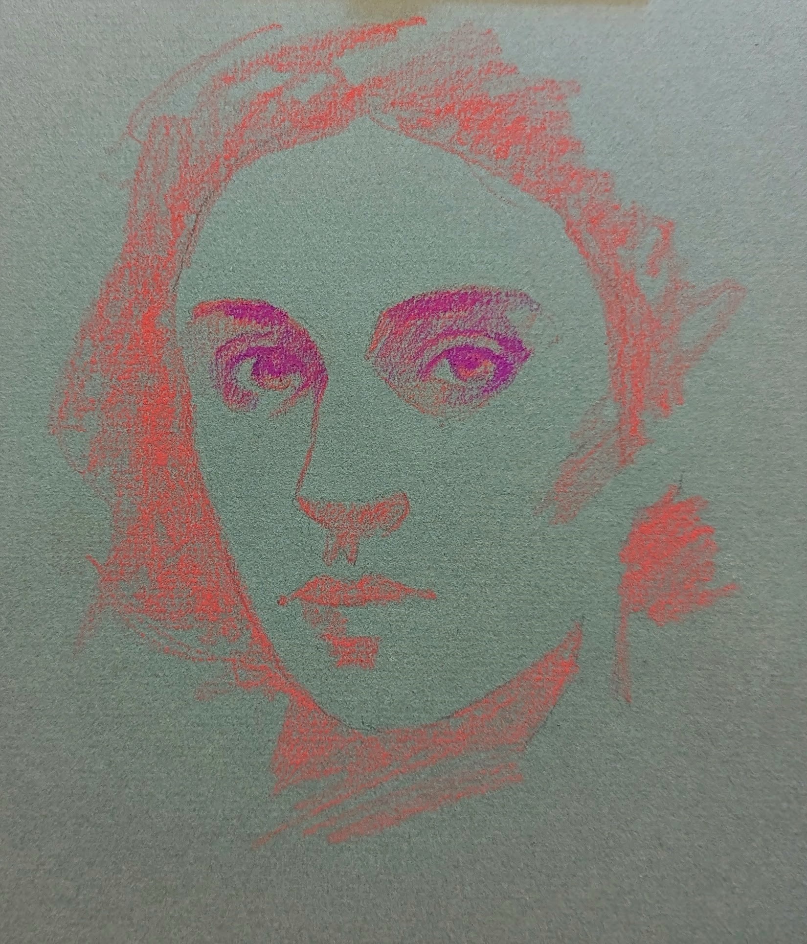
I began by sketching the value shapes with a bright pink pastel pencil. It is impossible for me to fully capture the experience with this photo, but the use of approximate complimentary colors in a similar value played with my eyes like crazy. The pink felt like it was quite literally luminous and vibrated against the gray-green. The process felt a bit surreal as a result.