by Lisa Larrabee
Value does all the work, but color gets all the credit. That phrase gets thrown around a lot, but what does that even mean?
We love color! Colors can be subtle or dazzling. Colors are powerful and can be used to get our attention or to communicate feelings. However, value relationships are often the foundation of a drawing or painting. Values can be essential to providing structure and to creating the illusion of light, form and depth.
Organize Colors by Value
If you want to experiment and take some risks with color, it can help to begin by first considering your values. In the example below, I began with a black and white photo reference that had a nice range of light, medium and dark values. I selected colors fairly randomly based on what I thought looked interesting while making sure I had different values. I then sampled the colors on my gray toned paper in order of dark to light.
I have been inspired recently by the drawings of Viktoria Maliar and her bold mark-making and color choices. It reminded me of exercises I did when studying the mark-making of Vincent Van Gogh's portraits back in college. I approached this study similar to others I have done when experimenting with my color choices. I focused on placing values where they belonged regardless of whether it made sense for the local color of the subject and with zero regard for lighting color or temperature.
I began by putting my lightest color (yellow) where I saw the lightest value. The second lightest color (blue) was used to block in the second lightest value. The teal and mauve are very close in value, so I made artistic choices that helped me clarify different parts within the value range. I used the burgundy more for drawing accents than to create dark value shapes. I never added my darkest value (brown) because I felt the drawing was finished.
If you look at this drawing in grayscale you will see that there is order to the values. That does not mean that the values are accurate to the reference. The original photo reference had much bolder, darker shadow shapes. I chose to stay in the mid to light value range with the dark color as an accent. Still, you can see that there is a sense of light and form of the subject as a result of the values having a sense of order and observation. The values are doing the work while the color gets to have all of the fun!
Artist Tip
You can often discover weaknesses is your artwork by taking a digital photo and switching to grayscale. Looking at your work without color will help you identify how well you are grouping shapes by value. This can be used abstractly to analyze your overall composition and design. It can also help to see where colors may be deceiving you by creating light or dark values out of context when trying to depict representational light, form or depth. It is important to note that your artwork does not have to "work" in grayscale to be successful in color. There are many exceptional paintings that rely on color and temperature shifts that stay within a reduced value range. This can sometimes make a piece appear flat in grayscale, yet be mesmerizing in color. Viewing your work in grayscale is simply a tool you can use to help you see it differently.
Play with Color
There is no wrong way to play with color. Try a variety of combinations to see what you are drawn to and how the color choices affect the overall mood of the piece. Choose colors you think look pretty together. Choose colors you think are hideous. Which colors feel happy, peaceful or melancholy? Use any colors that you want, but place them based on their values.
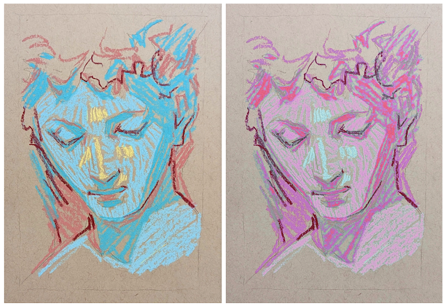
I digitally replaced colors from my drawing in Photoshop to show an example of how much the artwork can change with different color choices. The subject, mark-making and value placement is the same, but the drawing feels completely new. Creating similar multiples provides an opportunity to analyze the differences. For example, there is more unity in the digital variation because I used analogous colors (colors next to each other on the color wheel). The light blue accent has more color contrast than the pinks and purples, but it is less saturated, so it feels less jarring. In the original, the yellow highlight against blue has significantly more color contrast because yellow and blue are further apart on the color wheel. The digital version may also feel more comfortable because the pink tones feel more true to realistic skin tones than light blue and teal. (My family thought I had drawn a character from Avatar!). This doesn't make one version more right or wrong than the other. It is simply an opportunity to examine how different color choices can affect our experiences. Experiment and have fun!
Art Challenge
- Choose a simple subject. I recommend a black-and-white reference, so you aren't influenced by color.
- Ensure you have a good range of value shapes from light to dark.
- Draw or transfer your subject onto your white or toned drawing paper.
- If it is helpful to you, lightly map outlines around values shapes.
- Select colors that include light, medium and dark values.
- Order your color choices by their value from dark to light.
- Use the color that corresponds with the value from your reference.
- Create the same subject multiple times to contrast the differences.
You can mix and match whatever color combination you want. Start with simple combinations and add bolder choices as you feel comfortable.
~ Lisa


