9.28.2013

Painting the Light

by Lisa Larrabee

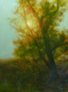
Westward Moon
2nd Place Acrylic & Oil, Richeson 75 
International Competition
24" x 18"
artist Lisa Larrabee

Sunrises and sunsets are so beautiful that it can be hard to take your eyes away from them and turn around. When you do, the reward can be equally as great.  Capturing the blazing red-orange light hitting the tops of the trees with the moon still overhead was my goal.  This began as a demo that I did over two painting sessions for my Acrylic & Oil painting class.  The final session was painted in my studio.


In the first class, I used Gamblin Gamsol (OMS) to thin Transparent Earth Red to cover the panel (oil primed linen).  With a little OMS on my brush, I lifted out the moon and wiped it white with a paper towel.  The trees were blocked in with a little Cobalt added to the mix.  What I love about this method is that I can adjust and move around elements on my panel with incredible flexibility.  It is my new favorite way to begin!

Spring Light: Painting Stages

by Lisa Larrabee

Spring Light
Oil on Panel
16" x 12"
artist Lisa Larrabee

This landscape painting is a study for a larger piece that I am working on.  The larger painting will include my son, Nathan.  It is intended to represent intellectual and spiritual growth and transformation.  I realized as I was working out the composition that the original tree reference I chose did not support this concept.  I created this study to experiment with color and mood to better tell the story.

9.20.2013

Self-Portrait: Finished

by Lisa Larrabee


I am beginning to wonder if you can paint a self-portrait indefinitely. I feel like I have achieved what I wanted to, so I am declaring this one finished. There are several other projects in the works that I am excited to devote some more time to. Overall, I enjoyed this entire process.

9.12.2013

Self-Portrait: One Thing Leads to Another

by Lisa Larrabee


Have you ever noticed that the closer you get to something the more there is to do? When I start to get some areas more accurate, other inaccuracies present themselves.  Tonight, I worked to get the pieces (drawing/proportion, values, color temperatures) into better relationships. Correcting some relationships made the incorrect relationships become more apparent.  For example, it bothered me that the eye on the left had looked dull.  It looked dull because the values were too close to the eye on the right that was in direct light with a highlight (but the left received no highlight).  To make the left eye feel more in shadow, I needed to make it darker.  With that realization, I noticed that all of my shadows were too light in value.  I also discovered some issues with the eye shape and the relationship of the left eye to the nose.  Changing the nose affected the mouth, etc.  The good news is that it keeps moving in the right direction. 

9.10.2013

Self-Portrait: Painting Eyes

by Lisa Larrabee


I think one of the biggest tricks when painting eyes is not to paint too much.  It is so important to simplify. The goal isn't to capture every eyelash, but to convey how the light travels across the form.  Ideally, if this is done with accuracy, the eyes communicate with you.  I think these eyes are fairly close to finished, but I feel that they look a little startled.  I also intend to drop the value of the eye on the left a bit.  It doesn't read that it is in shadow compared to the eye on the right (except that it doesn't have the highlight). We shall see how the rest of the painting develops.


I want to mention how much fun I am having with this painting.  Because it is a study just for me, I feel free to push myself.  I really wanted to focus on color temperature and I think I am making progress.  I don't know why I didn't do this sooner!

9.09.2013

Self-Portrait: Stage 3

by Lisa Larrabee


I realized when I sat down, that I needed to get the rest of the orange covered. It was still affecting my skin tones way too much. I also needed to push the darks so that I had a better range of values. There is more to do, but I am happy with the progress I made.

Self-Portrait: Adding Color

by Lisa Larrabee


At this early stage, I wanted to get areas covered with an approximation of color.  I needed to tone down the warm under-painting because it was affecting the cooler skin tones that I was putting down.  At this stage, I feel that I lost some of the likeness because I was working to get better color notes.  Still a long way to go.

9.08.2013

Self-Portrait: Blocking It In

by Lisa Larrabee


Who will sit patiently at odd hours as I work to improve my skills? ME! This is a picture of the first stage of a self portrait. I began without a preliminary drawing. It took a little time to get a feel for how to push and pull the paint. I lifted out highlights to reveal the lead white primed linen panel. I liked starting this way. It allows for both freedom and control.

9.02.2013

Two Pods: Painting from Life

by Lisa Larrabee

I was given some advice from an amazing still life painter, Scott Fraser.  He told me that I needed to paint from life.  It was the most obvious, yet necessary advice.  After seeing his paintings in person, I already knew that was exactly what I needed to do.  The richness in his work comes from observing what is in front of him without the limitations of the camera.  This is something I have known, yet I have found too many reasons not to follow this advice (limited time, limited space, expediency...).  I came home and saw my work with fresh eyes.  Eyes that saw the limitations of working from photography alone.  So, here is my goal.  I will be giving myself assignments.  I know where I want my work to go and I have a good idea of what it takes to get there -time and hard work.  Drawing and painting what I see without shortcuts.  The bottom line is that there is no such thing as a short cut when it comes to developing as an artist.


In the early stages, I experimented with a different way for me to block in the shapes.  I started on white, brushed on a thinned layer of transparent earth red and began wiping out highlights and pushing darks.  It was important to me that the shapes were accurate.  I used a view-finder to help keep the shape relationships correct.