Showing posts with label Landscape. Show all posts

10.24.2023

Upcycle Your Painting

by Lisa Larrabee

Do you every wonder what to do with old artwork that you feel is kind of meh?  Recycle it.  Better yet, upcycle it and make it better!  There are so many possibilities when it comes to upcycling your artwork.  Allow yourself to respond to what you have while simultaneously letting it go.  

I had some silicone paint shapers that I really wanted to play around with.  Rather than starting on a blank surface, I looked for an existing painting that already had some nice colors and textures that I could build on. 

8.24.2023

Paint with Charcoal

by Lisa Larrabee

Charcoal is both bold and forgiving.  You can blend and smudge charcoal or sharpen it to draw with precision.  Charcoal is a staple in most drawing classes, but did you know that you can also paint with it?


If you mix charcoal powder with water, you can paint using a process that is similar to watercolor.  The charcoal powder often pools and settles creating interesting patterns as it dries.  When the water evaporates, all that is left on the paper is the charcoal.  This charcoal can now be manipulated using traditional dry charcoal techniques.  You can blend, erase and add details using blending stumps, charcoal sticks and charcoal pencils.

3.16.2023

Start with Color

by Lisa Larrabee

Why start your drawing or painting on a color?  A background color can set the mood for your artwork and unify the elements right from the start.  It has the power to neutralize or enhance the colors layered over it.  Certain background colors can add or reduce energy, effecting the entire piece.  When a single decision has so much influence, it is important to take the time to explore the possibilities!

Effects of a Background Color

There is much to consider when choosing a color to build upon.  Think about how much you want to allow the background color to show through. You can draw or paint in a way that lets large areas of the background color be visible, or you can let little bits of color show through between the marks or brushstrokes.  You can choose to layer or blend the medium so that the color shows through subtly.  Depending on the medium, you can also cover areas opaquely to hide the color underneath.  How much you choose to reveal the background color will effect the overall style and mood of your piece.

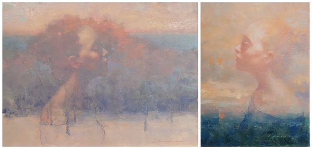
Profile on Cool (Whisper) & Profile on Warm (Promise) - by Lisa Larrabee

In these two examples there is a lot in common, but each painting captures a different mood.  Both portraits have soft edges, reduced detail, high-key values and are of the same model.  The portrait on the left was painted over a cool lavender background.  The portrait on the right was painted on a warm orange-pink.  It can be very helpful analyze the effect of a change when other elements stay the same. You can think of it like a scientific experiment where you keep most variables the same in order to best identify the effect of the change.

1.27.2023

Negative Space (Why It's Such a Big Deal)

by Lisa Larrabee

If you do an online image search for "negative space drawings" you will find a tremendous number of examples that range from traditional academic exercises to very creative design solutions.  Variations of negative space exercises exist at all levels of drawing classes (whether or not it is explicitly labeled as such).  So, what is "negative space" and why is it such a big deal?

6.14.2018

Emerging -Painting Stages

by Lisa Larrabee


Emerging
(detail)
Oil & Wax on Panel
24" x 36"
artist Lisa Larrabee


My Figurative Landscape paintings are intended to visually convey that people and nature are inextricably connected.  Although we often lose ourselves in our fast-paced lives, my hope is that we are reminded to slow down and contemplate how we are interconnected with others and the world around us.

What began as an idea, slowly developed through a combination of sketches, photo reference and experimentation by layering images in Photoshop.  I often blur or filter my digital image so that I  feel less restricted by detail and free to allow colors and textures to develop in the painting.

10.07.2017

When It All Comes Together

by Lisa Larrabee


to Love

9" x 12"
Oil & Cold Wax on Panel
artist Lisa Larrabee

Over the years I have picked up a variety of techniques that I felt would help me visually manifest the ideas within my Figurative Landscape paintings.  This summer I created paintings where multiple techniques came together in a way that felt fluid and natural.  It has been a very energizing experience.

2.19.2016

Paint Fearlessly! Exploring Cold Wax Medium

by Lisa Larrabee


Longing
Oil & Cold Wax 
12" x 16"
artist Lisa Larrabee

I always try to challenge myself with each new painting.  Still, there is always the thought at the back of my mind that reminds me that I don't want to screw it up.  I decided that I needed to create a painting where I could play and try out ideas with without the fear of failing.  I picked up an old painting demo that I wasn't attached to and jumped in.


The purpose of this demo was to block in the values in simple basic shapes.  I loved the light on the portrait, but I had no plan to develop the painting.  It was the perfect piece to play with.

10.10.2015

Paint with Realism and Expression

by Lisa Larrabee

A Quiet Reminder
Oil  18"x 24"
artist Lisa Larrabee


It has been a constant challenge for me to paint with... paint.  I would load up my brush with paint, lay it down on the surface with bold intention and then eventually smear it around until it was smooth and blended.  


This past summer, I took a workshop with an incredible artist, Henry Yan.  He told me my palette was starving.  I added more paint.  Would you believe that more paint on your pallet can translate to more paint on your painting?  It sounds too simple.

2.13.2015

Make an Impact with Color and Light

by Lisa Larrabee


Nature's Compliment
Oil  36" x 24"
artist Lisa Larrabee

A color is enhanced by the contrast of it's compliment.
So is the calm after the storm.


My first step was to block in the general shapes and color.  Everything is painted in a mid value range.

11.18.2014

Process Is Important!

by Lisa Larrabee


This picture shows a piece at the very early stages of my painting process with only one layer of color overall.  It was blocked in very easily for one important reason, I spent more time in the process stage.  
Process is important!  

6.09.2014

Richeson 75 International Competition: 2nd Place Winner

by Lisa Larrabee


Westward Moon was recently awarded 2nd Place for Oils & Acrylics in the 2014 Richeson 75 International Landscape, Seascape & Architecture competition.

"That beautiful moon looming over the last glow of the evening sun on the trees and soft light on the grasses is stunning. I felt a sense of serenity standing in front of it, dreaming of evenings chasing fireflies. Lisa has a gifted ability to capture the subtleties of nature and atmosphere making it easy for the viewer to enter her paintings with their own memories." 
~ Juror Molly Johnson, the Executive Director and owner of The Academy of Fine Art.

You can view painting stages of Westward Moon HERE.


11.30.2013

Painting In Progress

by Lisa Larrabee


I created studies of my son in preparation for this figurative landscape painting.  I also painted Spring Light to work out colors for the landscape.  My intention is to use the tree to portray the incredible intellectual, spiritual and physical growth of a young child.

9.28.2013

Painting the Light

by Lisa Larrabee

Westward Moon
2nd Place Acrylic & Oil, Richeson 75 
International Competition
24" x 18"
artist Lisa Larrabee

Sunrises and sunsets are so beautiful that it can be hard to take your eyes away from them and turn around. When you do, the reward can be equally as great.  Capturing the blazing red-orange light hitting the tops of the trees with the moon still overhead was my goal.  This began as a demo that I did over two painting sessions for my Acrylic & Oil painting class.  The final session was painted in my studio.


In the first class, I used Gamblin Gamsol (OMS) to thin Transparent Earth Red to cover the panel (oil primed linen).  With a little OMS on my brush, I lifted out the moon and wiped it white with a paper towel.  The trees were blocked in with a little Cobalt added to the mix.  What I love about this method is that I can adjust and move around elements on my panel with incredible flexibility.  It is my new favorite way to begin!

Spring Light: Painting Stages

by Lisa Larrabee

Spring Light
Oil on Panel
16" x 12"
artist Lisa Larrabee

This landscape painting is a study for a larger piece that I am working on.  The larger painting will include my son, Nathan.  It is intended to represent intellectual and spiritual growth and transformation.  I realized as I was working out the composition that the original tree reference I chose did not support this concept.  I created this study to experiment with color and mood to better tell the story.

6.28.2013

Fleeting: Final Painting Stage

by Lisa Larrabee


I want to make a point about lighting for other artists and students.  Unless you have a studio with amazing north light (and don't need to paint in the evening) you will have to rely on artificial light to paint.  I have used a mix of OttLite Natural daylight bulbs and GE Reveal daylight bulbs in my studio.  OttLites were recommended, but I found them very hash to paint under.  When I posted my last image, the color was adjusted to closely approximate what my painting looked like in my studio.  However, in the daylight, much of the warmth was reduced (even though I was using "daylight" bulbs).  I replaced the two remaining Reveal bulbs with OttLite bulbs to finish my piece.  It was difficult to adjust to the harshness at first, but the following morning my painting looked the same in the daylight as it had in my studio.  It may be difficult to notice a difference in the photographs, but it is noticeable in person.  I also bumped up a few of the brightest highlights.  I can now officially say that it is finished.  I hope that you enjoy it.

~ Lisa

6.22.2013

Fleeting: A Painting in Progress -stage 4

by Lisa Larrabee


The process of finishing this painting has become a balancing act between the tree and the figure.  I played with more contrast and harder edges on the figure, but decided that I was happiest where the two were more harmonious.  I most enjoy the repeating patterns of the arms and branches.  I had felt that it was finished, but on further reflection in the daylight, there are some additional changes I want to make.

~ Lisa

6.18.2013

Fleeting: A Painting in Progress -stage 3

by Lisa Larrabee


As I worked on the figure, drawing issues became more apparent.  I spent much of my time measuring, checking and rechecking the proportions.  I think it is pretty close so it's time to move on for now.

~ Lisa

6.14.2013

Fleeting: A Painting in Progress -stage 2

by Lisa Larrabee


I had a lot of fun bringing some color into the landscape.  At this stage I discovered that the Eucalyptus study that I started with proved to be invaluable.  It is still at an early stage, but I was capturing the essence of what I wanted very quickly.

~ Lisa

6.12.2013

Fleeting: A Painting in Progress

by Lisa Larrabee

I have typically shared my painting stages as an overview upon completing a piece.  Instead, I am going to share my process while I am in the midst of creating my current painting, Fleeting.

The inspiration for this piece is the Eucalyptus across the street from my house.  I loved the color of the light hitting the leaves and the pale bark of the branches.  I stepped out my front door and took some photos for future reference.


I began by creating a small (14" x 11") color study of the Eucalyptus to work out colors and techniques that I wanted to use on the figurative landscape.  I hope to keep the warmth and softness of the study on a larger scale.


I knew that I wanted to use loose draping fabric and bring up an arm (or arms) to create repetition with the branches.  Once I had shot some photographs, this pose jumped out at me and altered the overall direction I had intended for the piece.  The narrative began unfolding and I had to shift focus to the right.  After composing and editing in Photoshop, I was ready to proceed.  I used a sepia hard pastel pencil to draw directly onto my toned panel. 

La Primavera: Painting Stages

by Lisa Larrabee


La Primavera
Oil   24" x 18"
artist Lisa Larrabee

This painting is of a mother, pregnant with her second child, interacting with her young daughter.  I took photo references very informally in her home, where her daughter was more relaxed.  Blooming magnolia trees were added in Photoshop to create the more symbolic setting of springtime and renewal.


I began this piece by toning a 24” x 18” museum series gesso-board panel with a thin wash of burnt sienna.  Once dry, I used a blue toned transfer paper to accurately put my drawing onto the board.  So as not to lose the accuracy of the transfer, I carefully began blocking in the face and branches in oil using only brown and white.  I continued with key elements like the hands and face of the girl.  In areas where the values were too similar to the background, I painted some darker values into the background to help keep the value relationships aligned.