by Lisa Larrabee
Why start your drawing or painting on a color? A background color can set the mood for your artwork and unify the elements right from the start. It has the power to neutralize or enhance the colors layered over it. Certain background colors can add or reduce energy, effecting the entire piece. When a single decision has so much influence, it is important to take the time to explore the possibilities!
Effects of a Background Color
There is much to consider when choosing a color to build upon. Think about how much you want to allow the background color to show through. You can draw or paint in a way that lets large areas of the background color be visible, or you can let little bits of color show through between the marks or brushstrokes. You can choose to layer or blend the medium so that the color shows through subtly. Depending on the medium, you can also cover areas opaquely to hide the color underneath. How much you choose to reveal the background color will effect the overall style and mood of your piece.
 |
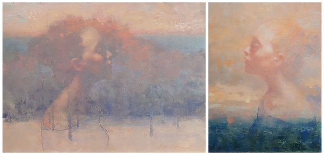
| Profile on Cool (Whisper) & Profile on Warm (Promise) - by Lisa Larrabee |
In these two examples there is a lot in common, but each painting captures a different mood. Both portraits have soft edges, reduced detail, high-key values and are of the same model. The portrait on the left was painted over a cool lavender background. The portrait on the right was painted on a warm orange-pink. It can be very helpful analyze the effect of a change when other elements stay the same. You can think of it like a scientific experiment where you keep most variables the same in order to best identify the effect of the change.
Color Considerations
- Temperature refers to the relative warmth or coolness of a color. We can simplify the color wheel by dividing it in half by temperature. Red, orange and yellow are on the warm half. Green, blue and violet are on the cool half. (Temperature is relative, but that is another discussion.) Choosing to begin on a warm background verses a cool background can set the mood before you even begin. Warm colors can feel comforting like a sunny day or cozy fire. They can also be passionate or aggressive depending on the hue and intensity. Cool colors can feel refreshing, tranquil or even melancholy. The color itself won't create the mood, but it will effect it.
- Contrast: We often think of contrast in terms of value (light and dark). However, contrast is simply a noticeable difference. The further two colors are from each other on the color wheel, the more different and contrasting they are. Complimentary colors are opposites and create the most color contrast. Color contrast is effective for drawing attention and for creating energy between colors. Choosing a background with low contrast (a color that is similar to the color of your subject) allows you to smoothly block in your subject without resistance. Imagine painting a portrait over a warm neutral base color. The background color helps fill in the gaps and you can add both dark and light values without the starkness of starting on white. Now, imagine choosing a background color that has high color contrast to your subject. For example, a soft warm background can create stunning color contrast underneath a cool, snowy winter scene.
- Chroma is the strength or intensity of a color. You can reduce the chroma of a color by adding white to create a tint, gray to create a tone, black to create a shade, or the compliment to neutralize the color. Choosing a background color that has less intensity will make it easier to add colors because it is less demanding of your attention and it will have less influence over the added colors. Working over light blue-gray is very different than working over a soft orange tint or a tan base. However, it is an entirely new challenge to work over a high-chroma red or brilliant turquoise. The more intense the background color is, the more control you must have to make it work for you. The colors will do unexpected things!
Color Agency
- Limit your palette. Get really familiar with fewer colors or color combinations before you add more.
- Photograph your work and check it in grayscale to see if you kept control of your value relationships.
- Create simple studies that let you experiment with color choices without self-imposed pressure to make a great piece.
- If working over a bold background color, spend time immediately blocking in large color/value areas to subdue the background and create context for the other colors.
 |
| Painting stages - Chasing Light, oil on panel, artist Lisa Larrabee |
Art Challenge
- Choose a simple subject. I recommend a black and white reference so you aren't influenced by color.
- Ensure you have a good range of value shapes from light to dark.
- Draw or transfer your subject onto different colored backgrounds.
- Use limited color choices over a variety of colors and create small, quick studies.
- Draw or paint the same subject multiple times to contrast the differences.
- On the left, I used black, white and yellow-orange on gray-green paper.
- On the right, I used black, white and light blue on warm tan paper.

